Understanding dataflow
Unlike traditional notebooks, marimo understands the relationships between cells and uses this information to keep your code and outputs consistent. These relationships are represented as a dataflow graph, which encodes how variables flow from one cell to another.
The dataflow graph, which is inferred statically from variable definitions and references, is used to automatically run (or mark stale) cells in the correct sequence; it's also why cells can be arranged "out of order" on the page, or across columns.
marimo provides several tools to help you visualize and understand the relationships it identifies between cells.
Variables explorer
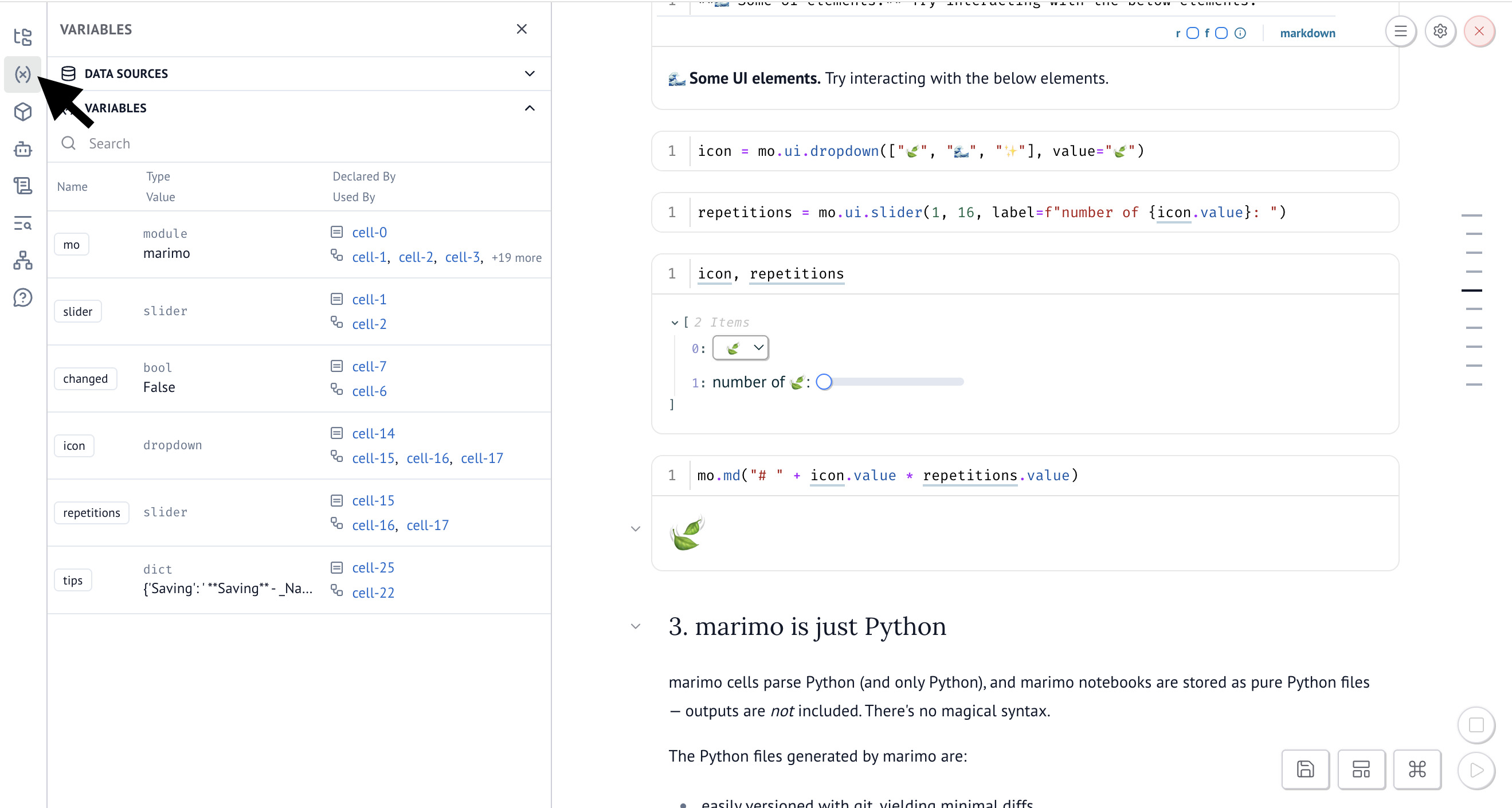
The variables explorer panel collects marimo's understanding of the variables in your notebook into a single searchable list.

To open the panel, click the variables icon in the left sidebar panel. The variable explorer shows each variable's name, type, value, where it's defined, and where it's used.
Dependencies panel
The Dependencies panel consolidates dataflow visualization tools into a single location with two tabs: Minimap (default) and Graph.
To open it, click the Dependencies icon in the sidebar, or use the hotkey
Cmd/Ctrl-Shift-I to toggle the panel.

Minimap
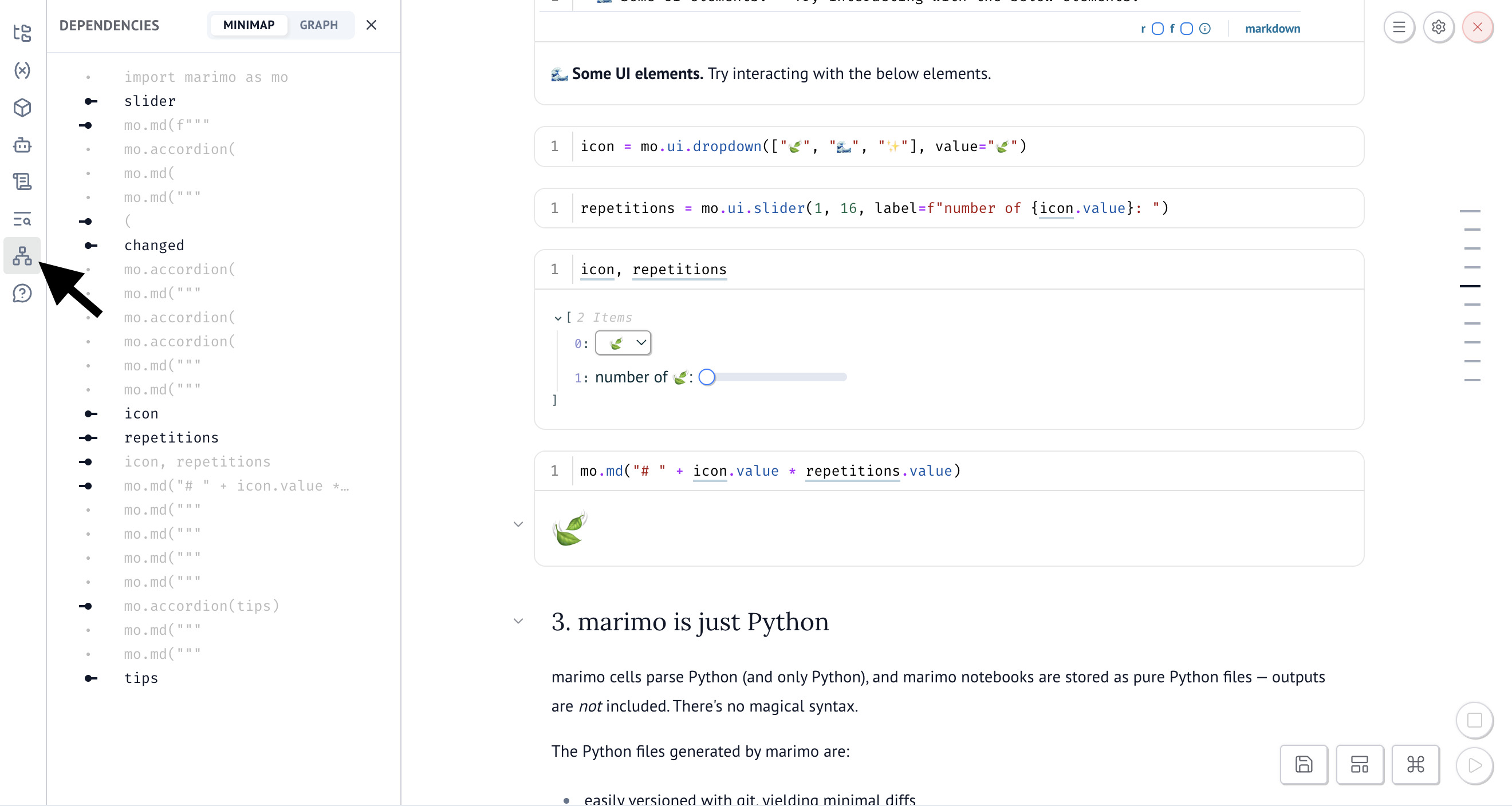
The Minimap tab (shown by default) provides a focused slice of your notebook's dataflow, helping you understand the reactive context of a given cell and navigate related cells.
Click a cell in the minimap to jump to it:
Connections are read left to right:
- Connections to the left are direct inputs — cells the current cell reads from
- Connections to the right are direct outputs — cells that read from the current cell
- Cells positioned left or right but not directly connected are transitive dependencies — cells that influence or are influenced by the current cell, but only through one or more intermediate cells
The minimap can take some getting used to, but it's an effective representation for understanding how data flows around the current cell. It's meant to show just enough local context to help you debug, trace relationships, and navigate complex notebooks. For a high level overview, use the Graph view.
Cell symbols
The minimap uses visual indicators to show the status and connectivity of each cell:
| Symbol | Meaning |
|---|---|
| Cell uses variables from other cells | |
| Cell defines variables used by other cells | |
| Cell uses variables and defines variables used by others | |
| Cell defines variables but isn't connected to anything (safe to delete) | |
| Cell doesn't define or use variables from other cells (often markdown) | |
| Cell has an error |
Reading cell connections
When you select a cell, the minimap draws lines showing how data flows between cells. Since marimo cells can define multiple variables, downstream connections show all cells that reference any variable from your selected cell.
| Path | Interpretation |
|---|---|
| First cell defines variables used by the second cell. Second cell will re-run when the first runs | |
| First cell uses variables from the second cell. First cell will re-run when the second runs | |
| Gray cell has no connection to the blue cells above | |
| Gray cell indirectly uses variables from the first cell. Whiskers indicate transitive dependencies | |
| Gray cell's variables are indirectly used by the second cell. Whiskers indicate transitive dependencies | |
| Cells have circular dependencies - each uses variables from the other (error) |
Implementation notes
The minimap was heavily inspired by Observable's minimap, a thoughtfully designed dataflow visualization for their reactive JavaScript notebooks.
We adapted Observable's visual design to marimo's execution model. A key difference: Observable cells are named (declaring one variable), while marimo cells can define multiple variables. This leads to asymmetric dataflow tracing. When tracing upstream, we can identify exactly which variables from a cell depends on. When tracing downstream, all variables in a dependent cell are considered affected. Our minimap also accounts for marimo's support for multi-column layouts.
Graph view
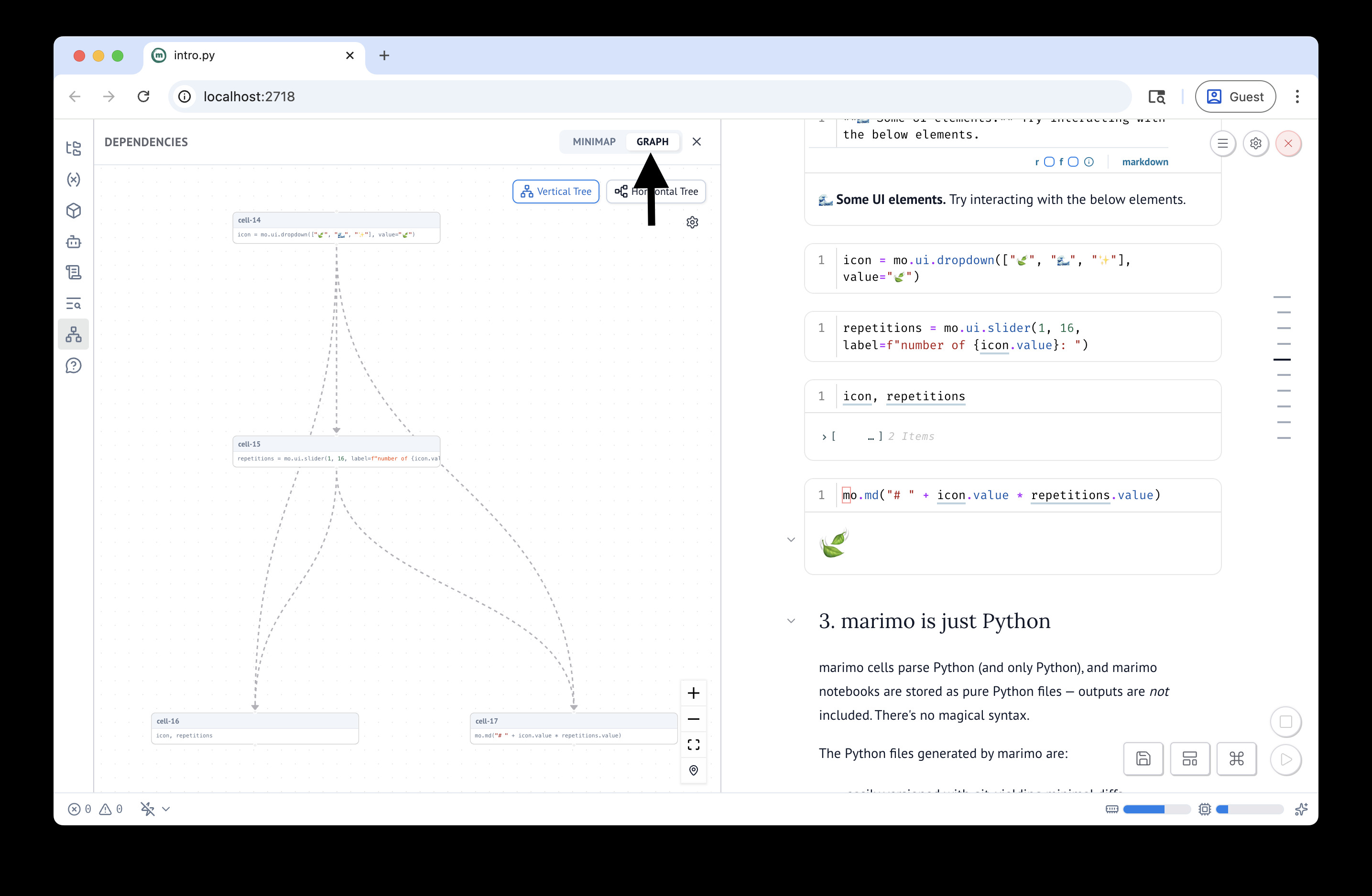
The Graph tab provides a bird's-eye view of your notebook's dataflow, showing all cells as an interactive graph. It helps you understand high-level patterns, overall connectedness, and the broader structure of your notebook.

You can choose between vertical or horizontal layouts for the graph.
Reactive reference highlighting
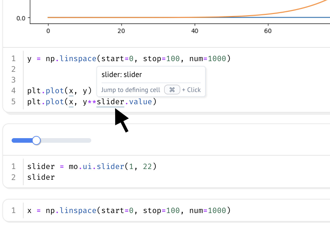
marimo's reactive reference highlighting provides an in-editor indicator when variables defined by other cells are used in the current cell. These "reactive references" are emphasized with an underline and lightly bolded text:

Hover over any underlined variable and Cmd/Ctrl-Click to jump to its
definition.